Rawls
Project Description
Website Redesign
Project Credits
Creative Direction:
Giorg Yela
Release Date
2022

About the project
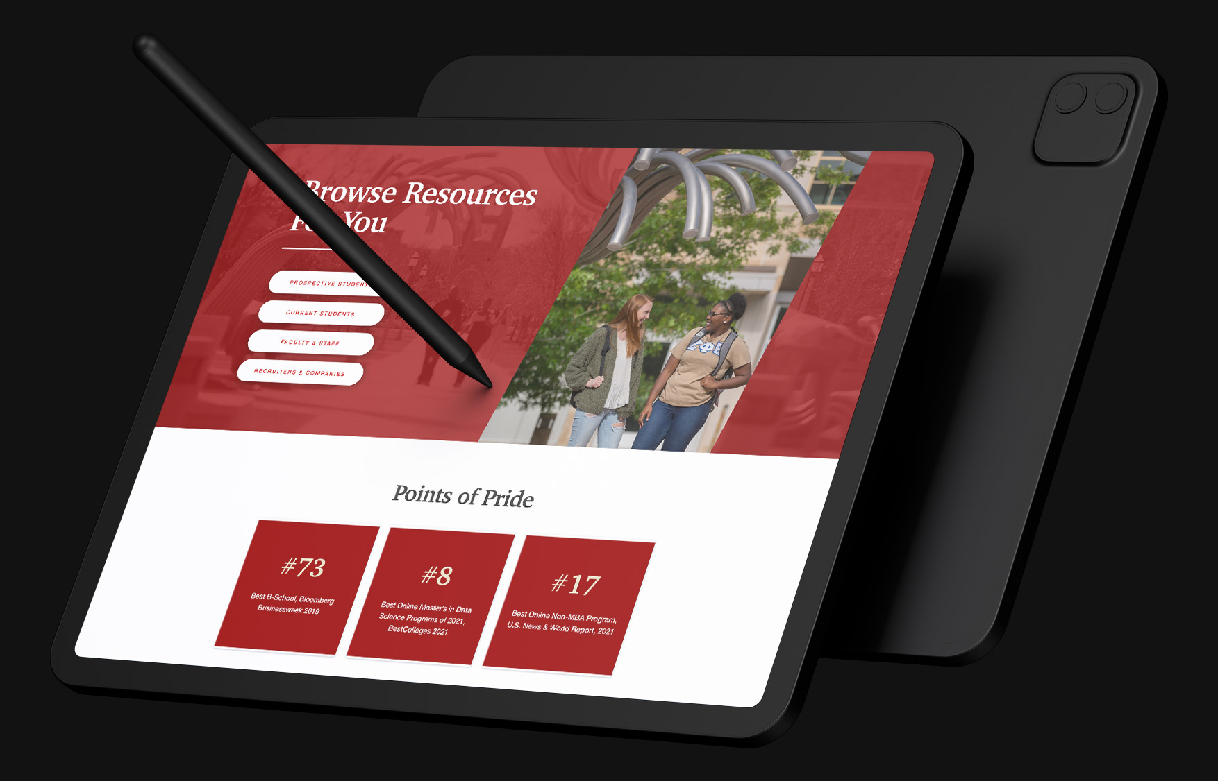
Redefining an academic brand through clarity, confidence, and usability
Rawls College of Business at Texas Tech University needed a digital presence that reflected its values of professionalism, clarity, and aspiration. The previous site lacked hierarchy, felt outdated, and made it difficult for students, faculty, and prospective applicants to find key information. The redesign focused on creating a modern, confident platform that elevated the college’s academic reputation while supporting its growing community.
A key challenge was balancing Rawls’ distinct identity with the broader structure of the Texas Tech University website. The new design had to feel unique to the college while still aligning with university-wide systems, accessibility standards, and content governance. Achieving that balance required thoughtful design and close collaboration across departments.
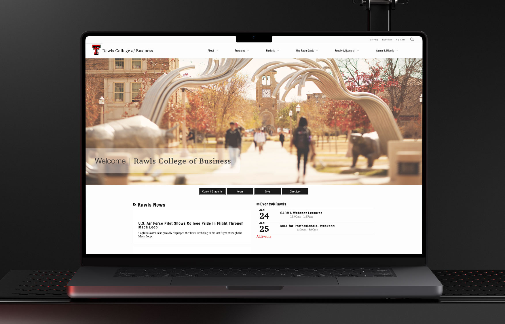
Below: The previous site’s dated structure and dense layouts made content difficult to navigate and failed to communicate the college’s professionalism.
Defining Structure and Flow
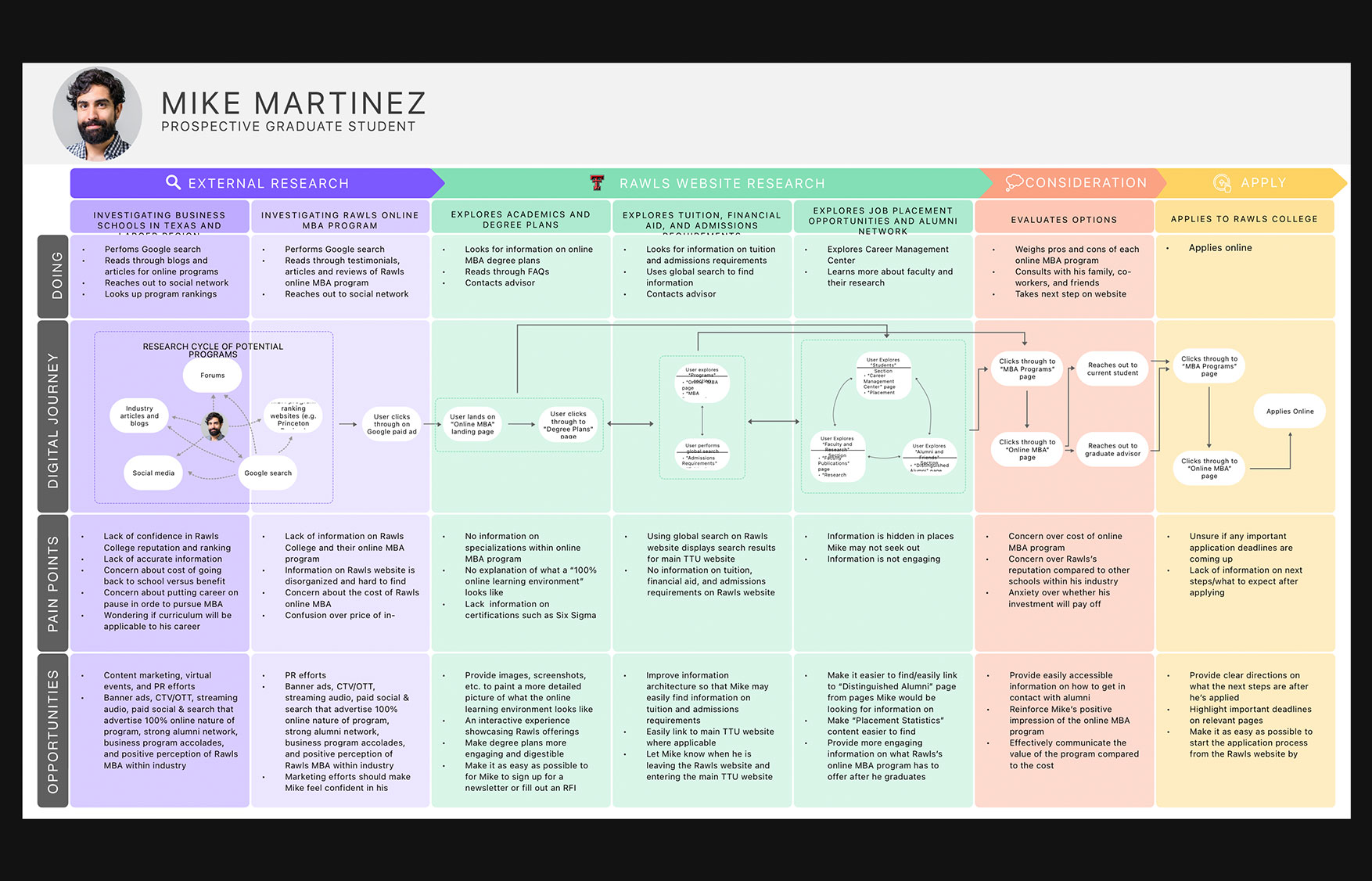
User interviews were conducted with stakeholders from various departments, current students, and alumni to understand the site’s challenges and content priorities. From these conversations, the UX team developed user personas to represent distinct audience segments and guide decision-making toward meaningful, goal-oriented experiences.
Building from these personas, I collaborated on user journey mapping to identify pain points and surface opportunities to create clear, obstacle-free paths for each audience. This research directly informed the sitemap and wireframes, which were developed in parallel with weekly stakeholder meetings to ensure alignment with their evolving vision throughout the process. Continuous feedback and iteration ensured that both institutional goals and user needs were addressed at every stage.
The project also carried a tight deadline, as the new website needed to launch before the start of the academic year. Coordinating across teams and maintaining weekly communication helped keep the project on track while meeting the high expectations of the university’s leadership.
Establishing the Visual System
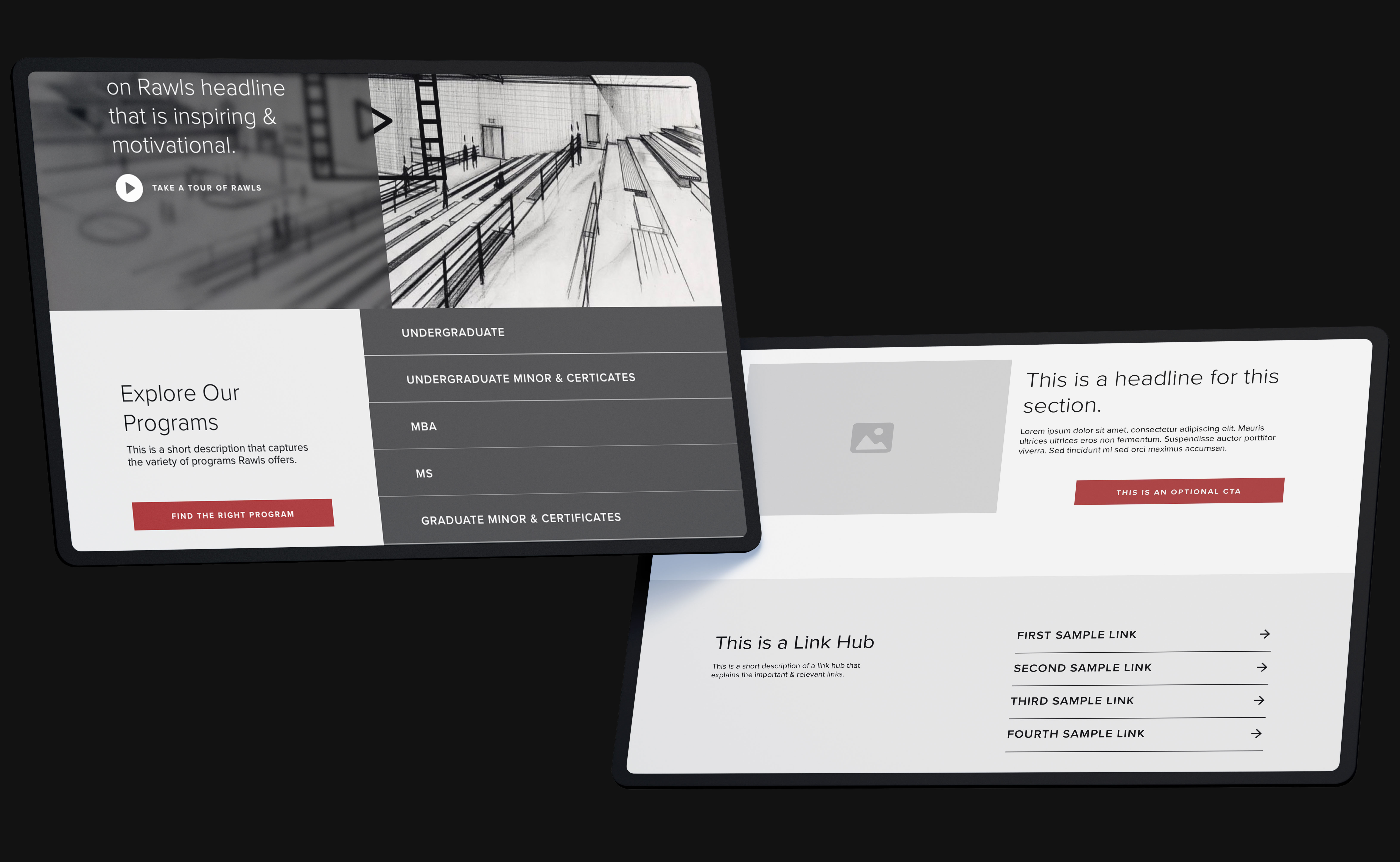
A refined visual system was created to bring consistency, clarity, and distinction to the Rawls brand. Bold typography established hierarchy and readability, while generous white space and a minimalist grid introduced sophistication and focus. The visual rhythm was carefully designed to balance long form content with promotional elements, maintaining a cohesive narrative across the site.
Subtle scroll based interactions and micro animations added depth and responsiveness without distracting from the content. Purposeful photography and graphic elements were integrated throughout to reinforce the college’s identity and lend warmth to the experience.
To showcase the college’s new video assets, I built a prototype that demonstrated how the hero section could bring these visuals to life. The prototype imagined how motion, pacing, and composition could work together to create an immersive entry point for visitors, framing the brand in a way that felt dynamic and aspirational.
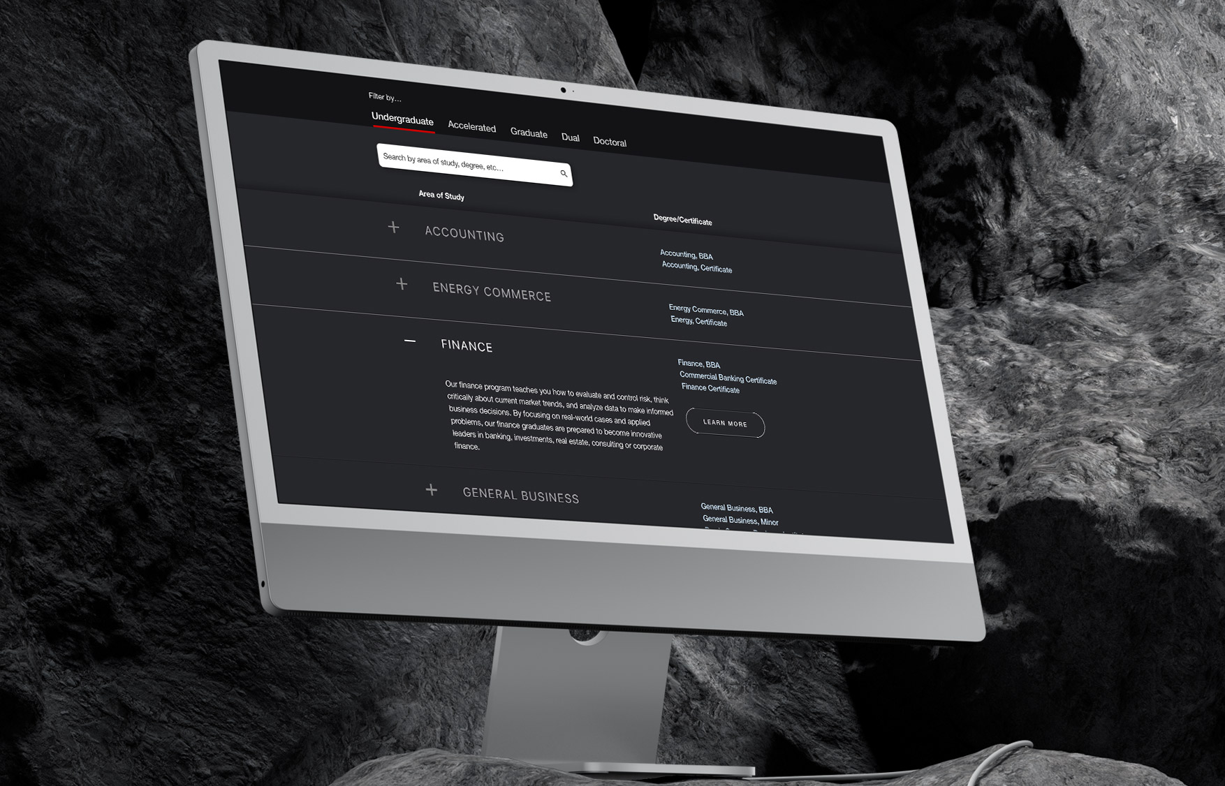
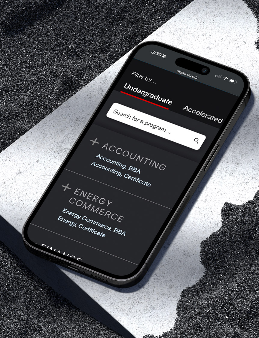
To support long term scalability, I developed a comprehensive system of reusable components and documented them for internal use. These modules were flexible enough to adapt across content types and screen sizes, ensuring visual consistency while allowing editorial freedom. I also worked closely with the content and CMS teams to build a flexible page structure that gave administrators control over layout, storytelling, and messaging without compromising design integrity.
Below: Prototype animation showcasing the hero video concept, scroll behavior, and modular layout interactions.


No items found.
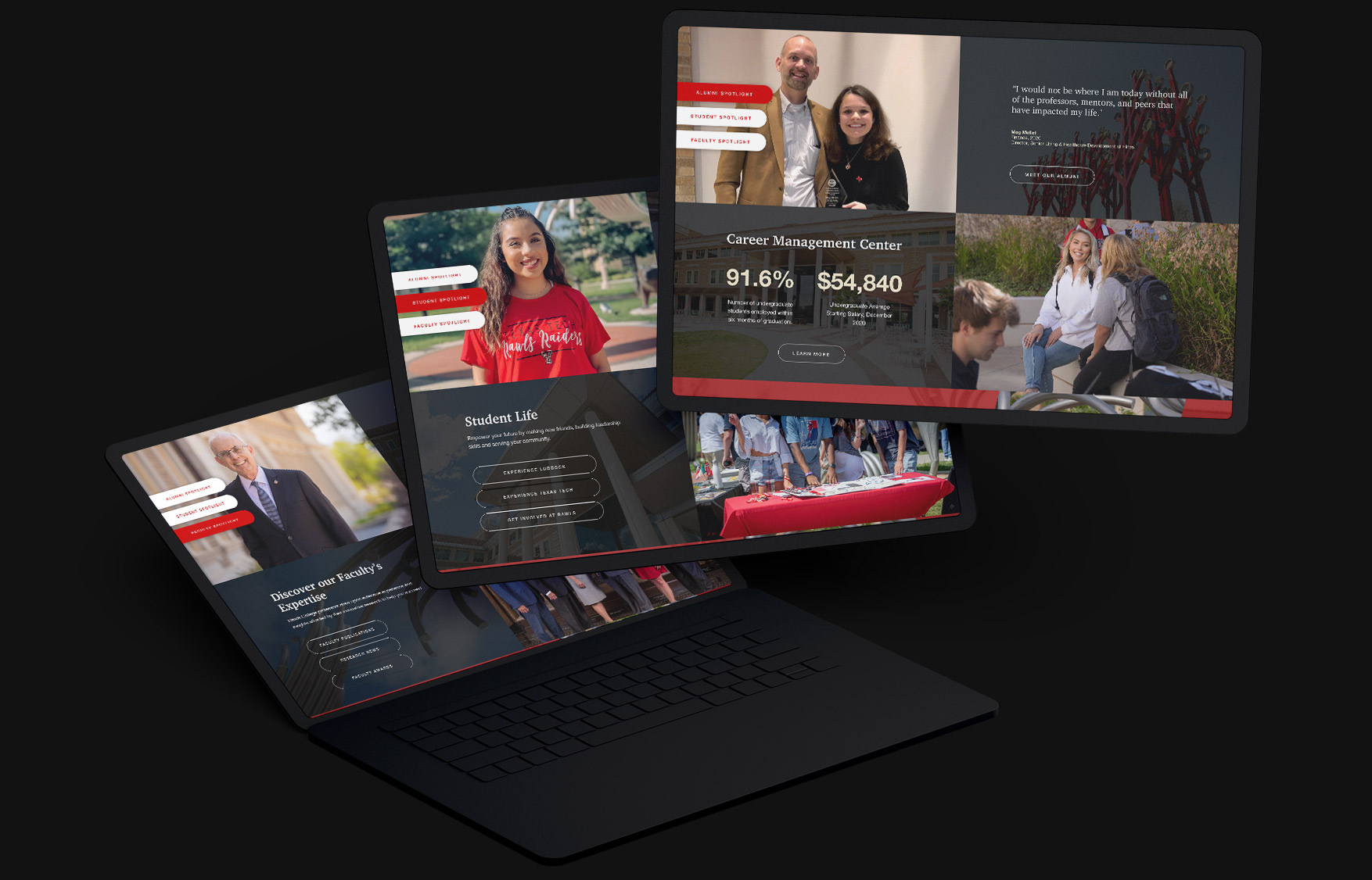
To support long term scalability and content flexibility, a comprehensive system of reusable components was developed and documented. These components allowed internal teams to build out pages confidently, without compromising the integrity of the design. Modules were built to adapt across different content types and screen sizes, ensuring visual consistency while allowing for editorial freedom. This system extended into a flexible page building structure within the CMS, giving administrators better control over layout, messaging, and storytelling.
The platform was launched on a tight timeline, with efforts coordinated closely across teams. This included a fast moving collaboration with a campus photographer to capture new imagery before the start of the school year. Despite the accelerated schedule, the outcome delivered a balance of polish and usability, enabling Rawls College to maintain and evolve its digital presence with confidence.

No items found.