Foothill Transit
Project Description
Foothill Transit operates 39 bus routes across Southern California, providing essential public transportation to thousands of daily riders.
Project Credits
Creative Direction:
Giorg Yela
Release Date
2023

About the project
Creating a rider first digital experience for clarity, accessibility, and trust
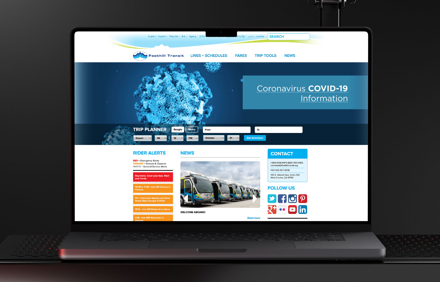
Foothill Transit’s legacy website presented major usability challenges. Navigation was confusing, real time tools were hard to access, and key content was buried or difficult to use, particularly for riders with limited mobility or digital fluency. The site was also not responsive, making it especially challenging for mobile users on the go who relied on quick access to route updates and schedules. Many users grew frustrated and turned to customer service instead of relying on the site. Internally, the platform didn’t reflect the agency’s innovation or commitment to accessibility, limiting its ability to inspire rider confidence.
The redesign focused on creating a more intuitive and accessible experience across devices. It also sought to better reflect Foothill Transit’s values as a forward thinking, environmentally conscious agency.
Below: The previous website’s complex navigation, lack of responsiveness, and dated layout made key features difficult to access, especially for new and less experienced riders.
Defining Structure and Flow
The process began with eleven stakeholder interviews that revealed friction points across departments. Navigation was overly complex, essential tools were buried, and content lacked clarity for both internal and public audiences. These discussions helped shape project priorities, improving usability, simplifying navigation, and emphasizing the agency’s mission to serve the community.
User journeys were mapped to understand the needs of different rider types. First time users, in particular, expressed uncertainty around how to prepare for a trip, pay fares, and understand what to expect while riding. Across the board, there was a shared expectation that real time tools should be accessible from anywhere, not hidden behind multiple clicks.
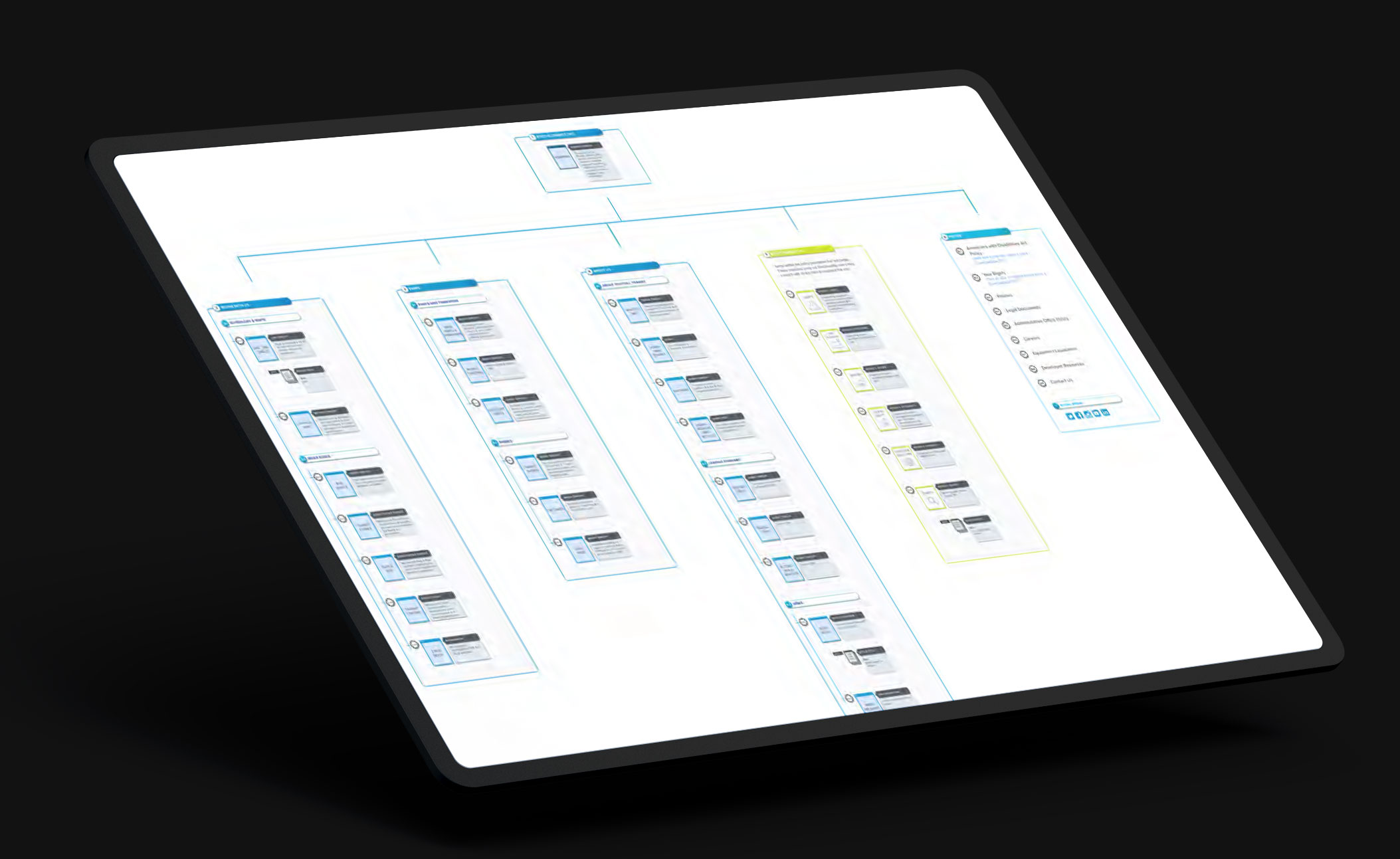
Informed by these insights, a revised sitemap was created to streamline the experience. It introduced clearer pathways for core actions, a Bus Basics section to support new riders, and dedicated areas to highlight technology, sustainability, and service to the region. Wireframes defined key interactions including the trip planner flyout, route maps, timetables, and a modular content system that supported flexibility for future updates. Early prototypes and storyboards clarified user flows, reduced ambiguity, and shaped onboarding elements such as location prompts and tooltips for accessibility and real time arrival features.
Establishing the Visual System
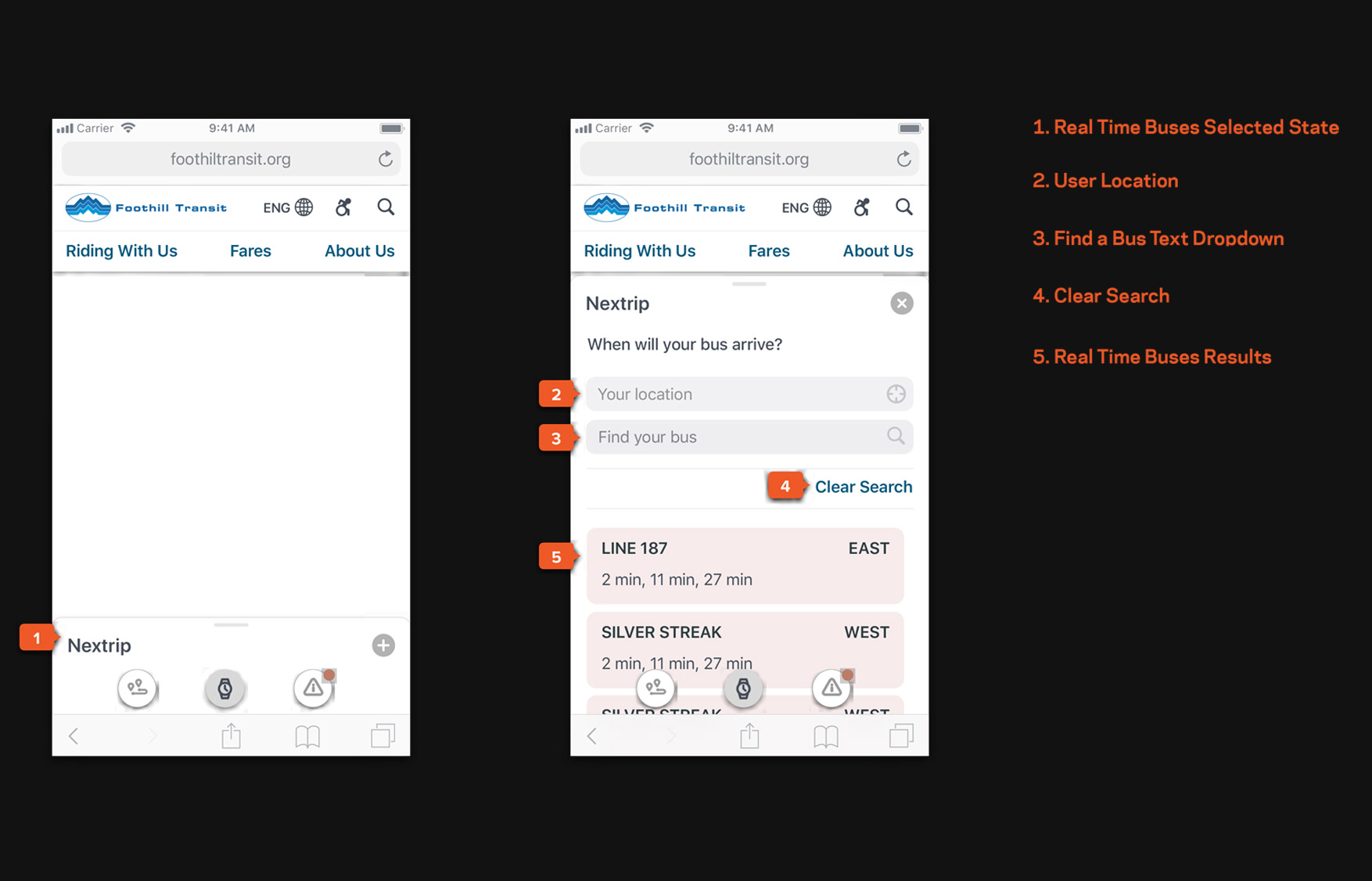
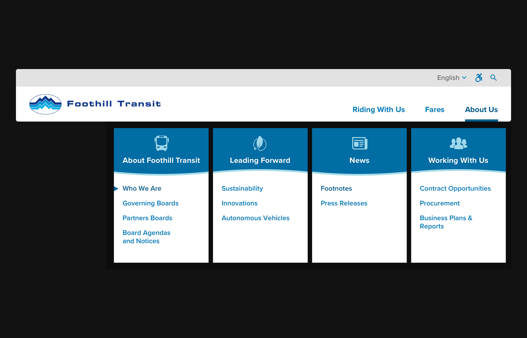
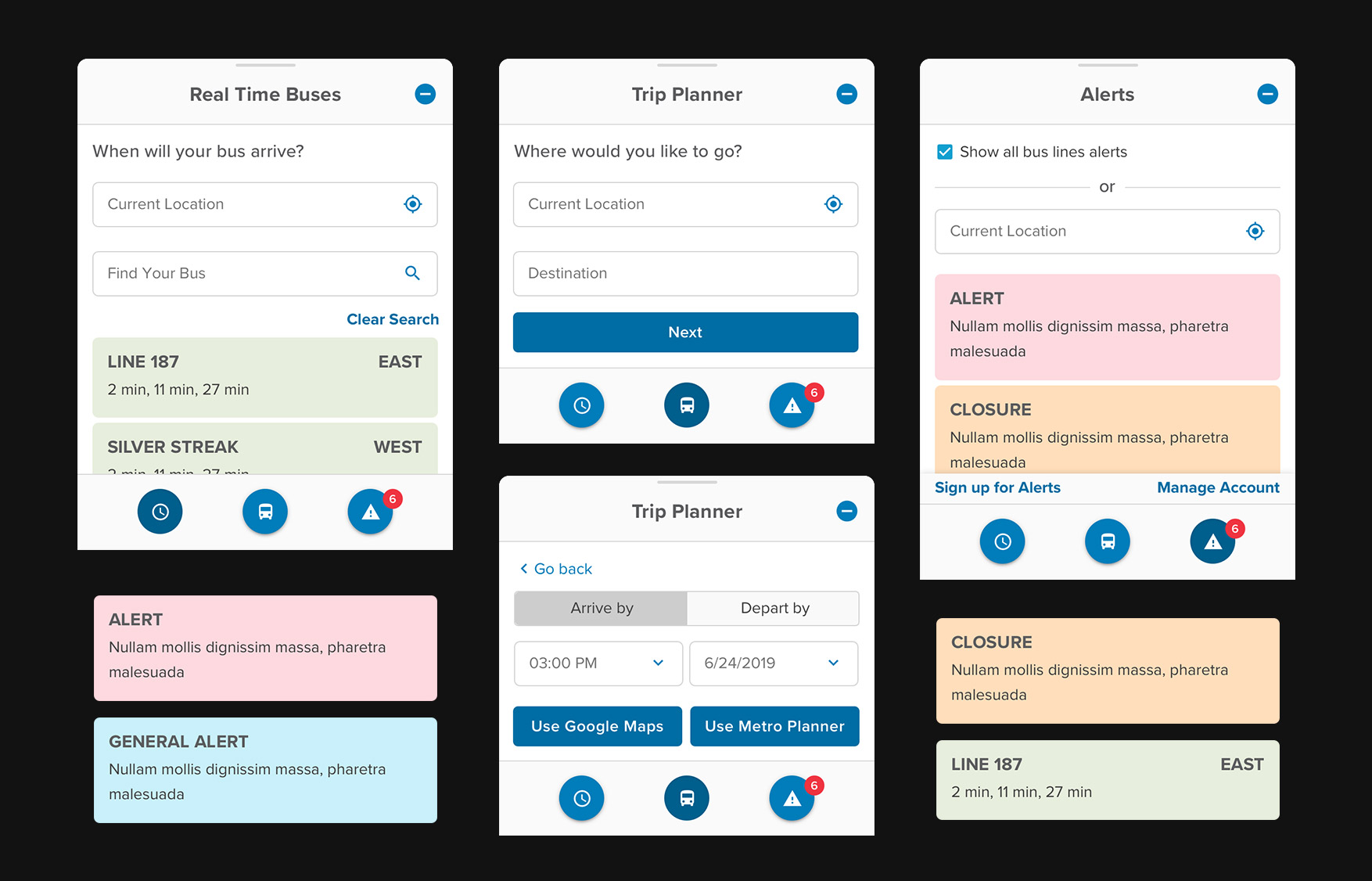
High fidelity UI designs established components that respected brand standards while introducing a clear typographic and color system for intuitive use. The Trip Planner was rebuilt as a sticky footer, giving riders persistent access and a simplified two step flow, select a start and end point, then choose a departure or arrival time. Users could also toggle between external planning tools like Metro (MTA) and Google Maps based on preference.
Real time arrivals were surfaced automatically through location access, and autocomplete helped riders quickly find any of the 39 lines. The alerts system was redesigned to allow users to view, filter, and subscribe to updates by route, location, or proximity, giving them the tools to plan ahead confidently.
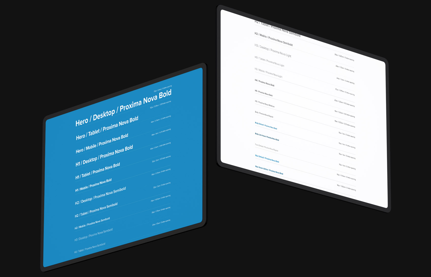
To support scalability and long term consistency, I created a comprehensive design system library aligned with Foothill Transit’s visual identity. It provided flexible, modular components and documentation to support future iterations and content expansion. I also produced high fidelity prototypes to communicate scroll based microinteractions and motion design that made the experience feel responsive and polished across devices.
Below: Prototype animation showcasing microinteractions, trip planner functionality, and navigation behavior.


No items found.
Delivering a Unified Experience
The redesign dramatically improved the rider experience, offering a modern, intuitive, and accessible interface from the start. The new site simplified trip planning, improved real time access, and redefined Foothill Transit’s presence as a reliable, rider first system.
The project was recognized with Best Mobile Visual Design and Function honors, reflecting both its design excellence and measurable improvement in user experience.


No items found.